
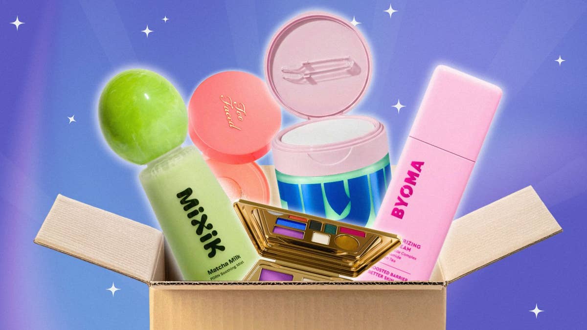
In February 2022, as COVID-19 restrictions loosened and consumers itched to bring the life back into dark days, Byoma skin care gained immediate attention. Launching with a sleek, geometric, color-blocked design, the London-based brand immediately made a splash on social media, primarily targeting Gen Z.
According to the brand’s launch agency, its release campaign generated 58 press placements in four weeks, including 14 standalone features and 253 social mentions across Instagram, TikTok and YouTube, with a reach of more than 27 million users.
Its social-first design was a stark contrast from the minimalist, muted packaging that had been dominating the industry in its millennial optimism days. Brands including Nécessaire, Ouai, Aesop and The Ordinary contributed to cohesive shelfies and quietly luxurious beauty counters. Even in the case of Drunk Elephant, which notably implemented bright color into its packaging in 2013, the pop functioned primarily as a point of differentiation and a playful accent, rather than an all-encompassing brand identity. It didn’t reflect the emotional cue that vibrant packaging represents today.
Photo: Courtesy of Byoma
“We were really at the height of the ‘clean girl’ aesthetic,” 3E Beauty Consulting founder and beauty packaging consultant Allison Kent-Gunn Garibay tells Fashionista of that time. “That extended beyond beauty and fashion, into packaging as well. We saw a lot of minimalism, earth tones, simple typography and very restrained branding. There was almost this belief that in order for a beauty brand to feel elevated or premium, it needed to be visually quiet.”
Fast-forward to 2026, and packaging has gone bold. Recent reporting by Mintel shows that brands are embracing vibrant hues, tactile finishes and retro-inspired aesthetics that elevate the “unboxing” experience on social media. This includes brands targeting younger consumers, such as Evereden, and millennial- and Gen X-focused brands, too. Mintel found that, “More than half of U.S. consumers pay close attention to the look and feel of makeup and fragrance products.”
“The current beauty boom has led to stronger innovations, and the idea that we all need to stand out more,” explains Lena Park, co-founder and director of Los Angeles-based K-beauty brand Mixik. “Attention is fleeting online and overwhelmed in stores, so brands need more ways to capture a consumer’s eye.”
Photo: Courtesy of Mixik
Since launching her brand in 2024, Park has seen a shift in how products are presented online especially. “There’s been a huge rise in colorful packaging and evolving forms,” she says. “Social media and direct-to-consumer-first brands really needed to lead with grabbing attention, and this was probably the most economical way. Lately, there’s been an explosion of rounded, curved and softer forms.”
Marc Jacobs Beauty’s 2026 relaunch deeply reflects the current state of beauty packaging. After discontinuing its previous line in 2021, the brand — once synonymous with glossy black packaging and silver hardware — returned with maximalist, playful colors and three-dimensional designs. It was a hit on social media.
“I know some people will say packaging does not matter, but this brings me so much happiness and joy when I’m doing my makeup,” TikToker Maddie Evans said of the brand’s Joystick Buildable Cream Blush Stick to her 115K followers.
Smashbox also chose to embrace more color in 2026: The brand swapped all of its metallic primer tubes to different colors, modernizing the visual direction overall to “stand out and evoke emotion,” says Jill Tomandl, vice president of global product development and innovation, Estée Lauder Companies, West Coast Brands. “It’s important for packaging to attract the consumer with a visually impactful design and help tell the story across social media, online and in stores.”
In a rare move, Korean beauty packaging is evolving, too. While K-beauty has historically been known for immersive, sensorial formulas and playful marketing, its packaging has traditionally stuck to a “clinical, minimal, similar aesthetic,” says Sora Lee, CEO and co-founder of Jiyu, who adds that “brands often don’t feel empowered to make bold choices, so they go the safe route. Korea leans more conformist, though that’s still evolving.”
Photo: Courtesy of Jiyu
“People are tired of products that all blur together,” Lee continues. “They want to grab something, know what it’s for, and actually feel something for the brand. Color is how a brand shows its personality before anyone reads a single ingredient.”
Park notes that this new wave (as evidenced by modern Korean beauty and fragrance brand Keyth, for example), is “supported by quickly evolving manufacturers in Korea and China who’re able to offer a larger variety in types of packaging.”
“It’s interesting that some of the most compelling examples of expressive packaging I’ve seen recently are brands [from] outside the U.S.,” Kent-Gunn Garibay says. She points to the fully aluminum packaging of Mexico City-based Aora Makeup, and also acknowledges Philippines-based Issy Cosmetics and Sunnies Face for their industrial design.
Photo: Courtesy of Aora Makeup
Alongside the need for differentiation in a crowded market, social media has clearly pushed brands to evolve their packaging even more. “Packaging isn’t just sitting on a retail shelf anymore. It’s being photographed, filmed, reviewed and shared across social media,” Kent-Gunn Garibay explains. “For many consumers, the packaging is actually their first impression of a product, so it has become an extension of the brand’s marketing strategy.”
That said, consumer expectations are higher than ever, and aesthetics shouldn’t come at the expense of functionality. “The best packaging solves problems,” the expert continues. “It protects the formula, dispenses consistently, minimizes product waste and creates a memorable experience for the consumer. A package can be beautiful, but it also has to be manufacturable, scalable, compatible with the formula and deliver a great experience from the first use to the last.”
Tolmandl agrees, praising Too Faced for its Peach Perfector Loose Powder, which features a roller ball that looks like a peach pit while dispensing the right amount of product mess-free. She also recognizes the Peach Shadow Palette, designed with a cushiony lid that evokes the softness of a peach and the eye-shadow formulas inside.
Photo: Courtesy of Too Faced
Ultimately, the experts agree branding will continue to evolve and cycle in and out of trends. But as Park points out, one thing will hold true moving forward: “Any strong brand leaving a lasting cultural moment must evoke an emotional attachment or resonance with customers.”
Occasionally, we use affiliate links on our site. This in no way affects our editorial decision-making.