
Invention, it must be humbly admitted, does not consist in creating out of void, but out of chaos.
— Mary Shelley, introduction to Frankenstein (1831)
Every OS update has a story to tell. With macOS 27 Golden Gate, that story captures a moment when Apple is faced with multiple challenges, many of which are tied to the rise of large language models.
One of those challenges is obvious. Apple was caught off guard by chatbots, overpromised a response at WWDC in 2024, and has been playing catch-up ever since.
But this isn’t simply a story of missteps or wasted opportunities. There’s more to it than that.
Supported By
InoreaderInoreader: Build your own newsfeed and cut through the noise.
Two years before ChatGPT took the world by storm and began its march to 1 billion monthly users, Apple released the first Apple silicon Macs. Whether intentional or a happy coincidence, Apple silicon’s unified memory architecture fits like a glove for running and fine-tuning LLMs.
macOS’ UNIX roots make it a great fit for AI development, too. From working with Python to coding with agents in Terminal, the Mac offers a familiar command-line environment for developers working with AI.
Claude Code at work on a Mac app.
Apple’s strength in these areas represents a huge opportunity for it and the Mac in the AI era. However, it’s that very industry that’s also fueling the challenges Apple faces.
Developers in the AI industry and power users setting up OpenClaw servers may have juiced demand for MacBook Pros and Mac minis, but data centers have made it hard for Apple to meet the demand for Macs and hold prices steady. Wait times for some Macs stretched into weeks and months this summer, and prices have risen. Still, Apple has continued to barrel ahead with new models, most recently updating the Mac Studio and Mac mini.
The AI industry has also been a drain on Apple’s talent pool, attracting hundreds of employees from across the company. Those departures are the backdrop to Apple’s high-profile trade secrets lawsuit against OpenAI, which involves former employees now working on AI-focused hardware. The result is a messy, turbulent era for Apple and the entire tech industry.
At the same time, macOS is completing its transition to Apple silicon by dropping support for Intel-based Macs in Golden Gate. It’s a big milestone, but one that pales in comparison to the just-completed CEO handoff from Tim Cook to John Ternus.
Against that unsettled backdrop, macOS 27 Golden Gate has a job to do. It needs to finish the transitions Apple has already begun by:
- cleaning up loose ends from the transition to Apple silicon,
- making good on Apple Intelligence promises of 2024, and
- tightening up the Liquid Glass design refresh that began with macOS Tahoe.
There are many other changes to system apps and other parts of macOS that I’ll explore in this review, too. But these three pillars invite us to evaluate how well Golden Gate builds on Apple silicon’s already solid foundation, delivers on Apple’s 2024 AI promises, and improves the everyday experience of using a Mac.
With that, let’s dig into the details.
View this on MacStories.
[table_of_contents]
DesignOf the three transitions that shape macOS 27, the Liquid Glass design language is the most recent. Announced at WWDC in 2025, the change drew strong reactions from early users and beta testers. Despite continued criticism in some quarters and vows not to upgrade until Tahoe’s design was “fixed,” I like Liquid Glass, as do most people I’ve talked to about it in my day-to-day life.
However, liking Liquid Glass is not the same as feeling that Apple nailed it with Tahoe. It didn’t. Tahoe’s design felt incomplete. It was as though there had been an all-hands meeting of Apple’s software designers who were given a detailed briefing on how to implement Liquid Glass but then they never talked again. Some apps took an aggressive Liquid Glass approach similar to iOS 26, while other apps felt like they’d barely been touched. In fact, there were even inconsistencies between how Liquid Glass was applied to different view modes in Finder.
Golden Gate addresses those issues with a more cohesive, readable experience. It also gives users control over transparency, addressing one of the core criticisms of Liquid Glass.
Icons
One of the most subtle changes to Liquid Glass is the way it diffuses light. The best place to inspect the difference is by looking at the icons side by side. The edges are darker, and the highlights are brighter, adding a greater sense of depth, while avoiding the softness and blurriness of Tahoe icons. The result is that UI elements are sharper and more readable, which is an accessibility and usability win.
Liquid Glass’ light diffusion update isn’t limited to icons, but because it’s one of the best ways to visualize the change, I’ve collected a few examples that show the change off especially well.
Examples of the evolution of Mac system app icons from Sequoia through two Liquid Glass iterations.
I like the refinement to Apple’s system app icons. What once made my screen look unnaturally soft and mushy is now crisp.
Alongside these changes, many icons have received small tweaks, such as Finder’s rounder nose. There’s also one wholly new icon and several material redesigns.
The new Siri icon alongside redesigned icons for Preview, Chess, Finder, Image Playground, and iPhone Mirroring.
What Golden Gate does not resolve is the so-called “Squircle Jail” controversy introduced by macOS 26. Starting with Tahoe, Apple mandated that all icon glyphs appear within the bounds of their background tile. Icons that violate the new restriction usually end up shrunken inside a generic “squircle jail” tile, which doesn’t look good.
Examples of “squircle jail.”
During the macOS 27 beta period, Paul Kafasis and John Gruber called for Apple to eliminate its icon rule, while Tyler Hall demonstrated a workaround. Nevertheless, “squircle jail” endures.
I can see both sides of this debate. On the one hand, as Kafasis argues, the uniform shapes Apple has imposed make it harder for people with color vision deficiencies to distinguish one icon from another. Former Apple designer Roger Wong takes a different tack, arguing, based on older Mac icons, that gaps in irregularly shaped icons can cause users to miss their click targets. Both arguments go to icon functionality and both have their merits.
On balance, I’m fine with the direction Apple has taken its icons. They mirror the design of icons on the iPhone and iPad, and there’s value in consistency for users who don’t think as deeply about icons as some Apple nerds. We’ve been trained through habit to expect that a squircle is an app. I also think Wong’s argument takes on even greater significance if the rumors that Apple is working on a touchscreen Mac are true.
Golden Gate takes a more restrained approach to icons in menus.
Finally, the proliferation of SF Symbols in app menus has been reversed, too. You’ll see fewer in system apps, and Apple’s Human Interface Guidelines have been revised to advise third-party developers to use the icons “sparingly and with purpose.” Also appearing in the menu bar is a new Ethernet icon that replaces the Wi-Fi icon when your Mac is wired to a network.
Transparency and Toolbars
Alright, enough about icons. It’s time to think about transparency. Apple’s designers have significantly improved the readability of Liquid Glass elements throughout the system and given users a tool to tweak transparency to suit their own tastes.
I don’t envy Apple’s designers who have to design a UI that works with any app whether it exists today or someday in the future. The first iteration of Liquid Glass worked well with some apps, but fell down in spots, such as when the background of an app was busy and unpredictable. Music with its colorful album art and Photos with its views of photos of literally anything someone might take a picture of are both great examples. As you scrolled through music or photos, both apps’ toolbars often seemed to disappear or become unreadable as colors passed beneath the toolbars. Text-heavy apps like Finder presented a similar problem, sometimes causing the text of scrolling lists of files and icons to compete with the toolbar’s content.
Appearance settings now include a transparency slider and a preview of its effect.
macOS Golden Gate solves this with toolbars that diffuse the content beneath them better at the OS’s default setting. That default is squarely at the midpoint of a slider found near the top of the Appearance section of System Settings. Move the slider’s indicator to the left and more of the background will bleed through toolbars, and move it to the right and the background frosts over to a nearly solid color. The setting is accompanied by a handy preview that shows the effect that each point along the spectrum has.
A great example of the change is Photos, which has regained a toolbar structure that separates buttons from the content scrolling behind them. It’s a welcome change to an app that struggled with a more transparent Liquid Glass approach.
Photos’ updated toolbar gives its controls a clearer separation from the images that scroll underneath it.
Apple’s solution is a good one. It would have been simple enough to give users a slider and be done with the transparency controversy, but instead its designers took the time to improve the default, too. The new default strikes a good balance between transparency and opacity that I expect most users will never feel the need to change. In contrast, I’ve always liked Liquid Glass’ transparency, so I set it all the way to the left where things are most transparent and never looked back.
Interestingly, I did the same thing on the iPhone and eventually dialed the Liquid Glass back a little. It may be the smaller screen or the fact that I use my iPhone in the bright North Carolina sun so often, but on the Mac, full transparency looks less extreme to me.
Toolbars also benefit from a more unified treatment. With Golden Gate, a continuous bar appears beneath controls automatically when content scrolls under them.
Sidebars, Corner Radii, and Drop Shadows
macOS Tahoe turned sidebars into glass-like slabs that sat on top of a window. I liked the layered look, but many others didn’t. Plus, when one window was obscured by others, it was too hard to tell if what you saw poking out was two windows sitting on top of each other and slightly offset or a sidebar.
Sidebars extend to the edges of windows, and deeper shadows make overlapping windows easier to pick out.
The fix is to extend sidebars to the top, bottom, and side to which they’re anchored. The sidebars retain their glassy look and icons have regained their color, but the layering effect is gone. I can’t help but feel like something was lost in the update, but from a practical standpoint, it’s a usability win.
Golden Gate also brings more consistent corner radii to system windows. I honestly never noticed the difference between window corners, but it bothered some users who will no longer be bothered, which is a plus.
Finally, there was something about Liquid Glass that could make it hard to distinguish one window from another. I experienced this with Tahoe myself, especially in Dark Mode. macOS Golden Gate has more pronounced drop shadows, which become the new normal very quickly, but do a better job of defining the separation between windows.
Wallpapers
Golden Gate’s abstract curves (top) and the Golden Gate Sunset wallpapers (bottom).
As always, this year’s macOS update comes with a beautiful set of wallpapers including Golden Gate, a dynamic golden wallpaper with sweeping curves that vaguely resemble the number “27,” and Golden Gate Sunset, a shot of the Golden Gate Bridge with an animated screen saver that’s mesmerizing to watch.
This year, the Mac’s stylized wallpaper also appears on other Apple devices, bringing a shared look across platforms.
Other Tidbits
We’re living through a menu bar app explosion thanks to AI coding agents, making it harder than ever to manage your menu bar. That’s especially true on Mac laptops with a notch. It really doesn’t take much to fill up the available space and end up with icons hidden by the notch or the tail end of an app’s menus.
There are third-party apps like Ice that will manage your menu bar for you, but new macOS releases can break them. That’s why on my MacBook Pro, I’ve historically aggressively managed my menu bar instead. But even then, it can be hard to avoid hitting the notch.
The double-arrow icon reveals menu bar icons hidden by the notch or an app’s menu system.
With macOS Golden Gate, Apple has added an overflow control in the form of a double arrow that appears when the notch or menu system is covering menu bar items. Click it and the hidden menu bar items appear to the left of the notch temporarily, so you can interact with them. This is especially helpful if you use all of the available space up to the notch and a new app installs a menu bar item that you want to move where you can see it, but it’s been hidden.
The Mac isn’t a static hardware platform, and its OS shouldn’t be either.
I like what Apple has done with Liquid Glass in Golden Gate a lot. My main reservations last year were the inconsistent implementation and poor legibility in apps like Photos and Music. The result is more coherent and usable, though whether the update is enough to satisfy Liquid Glass’ harshest critics remains to be seen.
The shape of icons matters, but it isn’t the design change that affects my use of the Mac the most. Clearer toolbars, windows that are easier to distinguish, and consistent controls have had a much more substantial impact.
More importantly, though, I appreciate seeing macOS’ design evolve alongside its hardware and the new tasks they’re called on to do. The Mac isn’t a static hardware platform, and its OS shouldn’t be either. I’ll miss the flourish of icons that escape their bounds, but if it makes it easier for more people to move from the iPhone, which is a far larger platform, to the Mac, that’s great. Software is never finished. macOS Tahoe’s design pointed the Mac in the right direction, but was a big enough departure from the past that it had some rough edges. Golden Gate addresses my biggest complaints with Tahoe and has been a pleasure to use all summer.
Siri AI and Apple IntelligenceApple Intelligence spans all of Apple’s platforms. Source: Apple.
The Siri app may be the marquee update of Golden Gate, but Apple Intelligence touches nearly every surface of the OS this year. In fact, I wouldn’t be surprised if, as soon as next year, features that integrate some sort of AI are still categorized under the umbrella term “Apple Intelligence” but are no longer treated as the standalone category that they have been for the past few years.
I say that because what’s striking this year is that everything about Apple Intelligence feels better integrated into macOS. Siri is perhaps the best example of all. What was once a voice assistant remains a voice assistant, but it has its own app now, too. Plus, Siri can be invoked from Spotlight, the Services menu, or simply by highlighting text and querying it with the “Ask Siri” contextual popup. It’s the sort of tight integration that Apple is known for, and its absence made some past iterations of Apple Intelligence feel bolted on.
Siri is embedded throughout macOS 27, including in Spotlight.
Before diving into the new Siri app, it’s worth keeping in mind that Siri AI is launching as a beta on Apple’s platforms and is only available in English. Apple has also restricted Siri AI’s use, prohibiting kids under 13 from using it, and it’s not available in the EU on the iPhone, iPad, and Apple Watch, but is available on the Mac. The new AI features won’t be available in China initially either.
What’s less clear is what limits Apple will put on Siri AI usage. Apple is offering enhanced access for now, but says cloud-based features are subject to usage limits and expanded access will eventually be a paid feature. The practical impact of these limits is currently unclear. That’s an important thing to keep in mind because my evaluation of Siri AI is as it exists today. Whether it’s worth paying for more than whatever the base usage winds up being will have to be evaluated another day.
I’ll get to all of the Apple Intelligence features you need to know about here and elsewhere in this review, but the best place to start is with the new Siri app because it’s undeniably the epicenter not just of Apple Intelligence, but all of macOS Golden Gate.
The Siri App
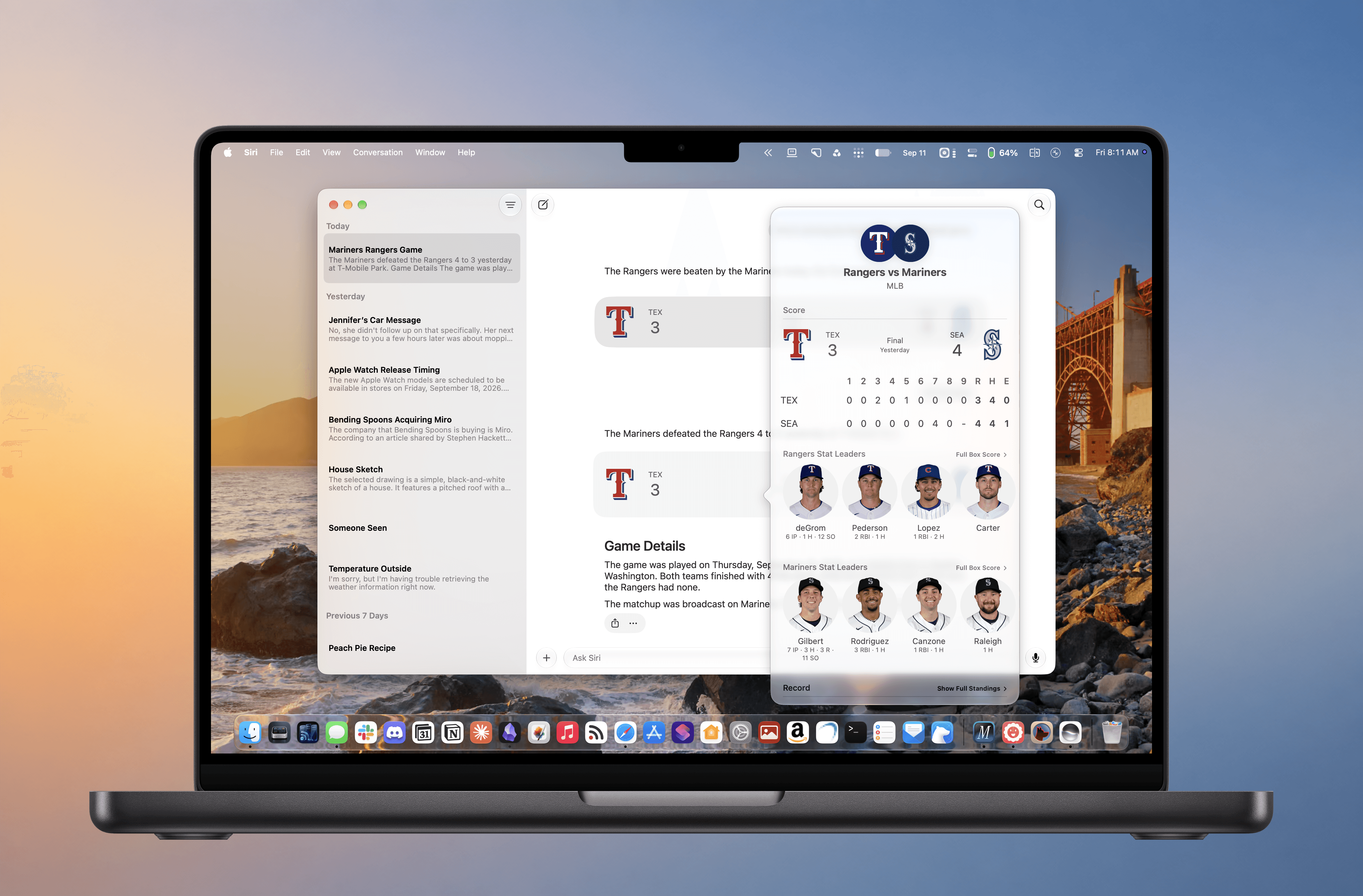
The new Siri app.
What goes around comes around. Siri started life as a standalone app all the way back in 2010. With the release of macOS 27 and Apple’s other OS updates, Siri is once again a separate app, while also remaining deeply integrated in other parts of macOS.
However, the new Siri app isn’t users’ only alternative. Siri’s new smarts have been baked into Spotlight, the Services menu, and individual system apps. That makes Siri more accessible than ever, lowering the friction of getting answers considerably, which is a big improvement over past Siri implementations.
But having Siri answer questions and having it take actions on your behalf are very different things. So, while you can ask Siri just about anything from anywhere, the results you’ll get will depend considerably on the information or actions you’re seeking. Siri’s world knowledge and ability to take actions at your direction are a big leap from the past. If asking world knowledge questions is your primary use case, I expect you’ll like the Siri update. However, if you’re already deep into tools like ChatGPT Work, Codex, Claude Cowork, or Claude Code for automation or assisting you with typical office work, you’re going to hit friction points quickly. That’s why it’s worth exploring what Siri can and can’t do as you think about how it might fit into your everyday work.
There’s a lot of ground to cover with Siri, so let’s get started with the Siri app itself.
The App and How It Works
Asking Siri about a video in Safari.
If you’ve used an app like ChatGPT, Claude, Gemini, or Perplexity before, you’ll know how to use the Siri app. In fact, it’s far simpler than those apps. The Siri app has a sidebar on the left that displays your past chat threads in reverse chronological order, syncing them among your devices via iCloud Sync. Threads can be displayed as a list or a grid, which shows off images and other rich media in a thread. You can also pin conversations, which then sit at the top of the list or grid regardless of how many other chats you begin, and delete past conversations individually or in batches by selecting multiple chats.
The main part of the Siri app’s window is where you chat with Siri AI, Apple’s updated assistant. From here you can type queries or speak them using Apple’s built-in dictation feature. You can also add files and images to a conversation, start a new conversation or search past conversations. There’s really not anything more to it than that. In fact, the Siri app doesn’t even have its own in-app settings. You’ll find those in System Settings, instea