
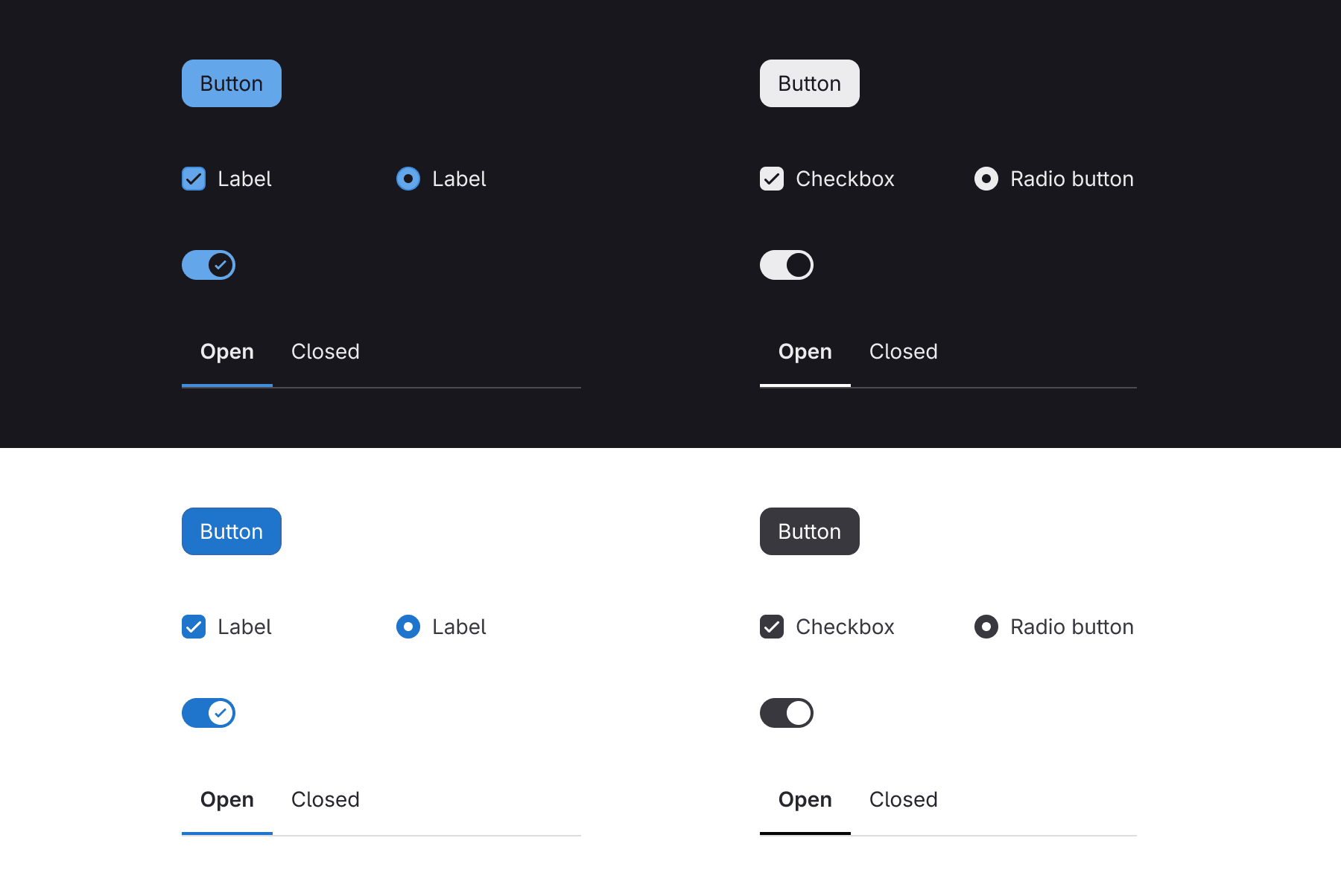
Throughout this year, the product interface has been in a season of reduction. On the heels of dark mode, the tide has been moving out with a quieter application chrome, overall color reduction, and neutral controls. It can feel like loss, low tide always does. But low tide is also when you can see the shape of the shoreline clearly enough to build something new on it.
What’s coming in is a user interface built for a different kind of work where you don't search for the right button, it surfaces at the moment you need it. This is a conceptual shift that needs room to breathe, and we’re clearing the way for it.
Tech goes through cycles like this. Touchscreens replacing physical buttons felt like a loss at first, until gestures, voice, and haptics enabled a deeper kind of interaction and expression. Cords gave way to wireless and each generational change introduced real friction for a time. The tide going out isn’t the point, it’s the possibility of what comes in with it.
Here’s what’s changed in the GitLab UI:
- Neutralized actions and controls (buttons, form controls, toggles, tabs) with increased contrast
- Enhanced instance theming addressing more surface area
- Neutral palette update and tinted neutrals for themes
- New bloom-style glow visual element draws attention to GitLab Duo interaction and moments requiring user input
Our version of that cycle started years ago when we removed many of the old Bootstrap variants and continued as we moved to design tokens. Instead of sharing a crowded palette, we scoped categories like actions, feedback, and controls more narrowly. Color in the product had a real problem of trying to do too many jobs at once and resulted in some screens feeling “lit up like a Christmas tree.” Generally speaking, enterprise software limits color so that when it shows up it means something. That’s the direction we’ve been iterating on for years.
Changes like this are rarely perfect on the first pass. Something looks fine in review and initial testing, and problems only become apparent with broad use across the larger product surface area. A user might struggle to tell two states apart or locate a control, which can also hint at larger UX or composition problems worth fixing. That’s not unique to this rollout, it’s how iteration works. We keep a UI feedback issue and address comments.
We’ve made it this far without a mention of AI, but here we go. A quieter, more reductive UI isn’t the goal in and of itself. The next UI wave won’t live solely in elements waiting to be clicked, it’ll live in intelligent, self-surfacing moments. An already loud UI drowns that kind of interaction out.
We realize that not all of the changes will be received the same way, sometimes for subjective reasons, and at other times for very objective reasons. That distinction matters to us and we want to hear about both. Drop a note in the feedback issue.